Job Search Data - 2023 June
“Shopping” for a job is not always a fun process. After a large layoff at my previous employment (a start-up company) in May 2023, I started searching for a new job. I decided to make this job search “fun” by collecting some data and creating some cool plots!
🔑 LinkedIn was great!
One thing I found interesting the most is how much easy it is to find matching opportunities in LinkedIn, at least for the field I am in. I tried a few other places including Indeed, but LinkedIn suggestions were the most relevant by miles. Also, that was true for the recruiters that reached out to me through the LinkedIn profile.
🦾 Connections get you far …
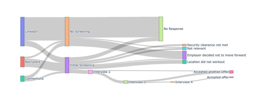
Another thing I noticed is that all opportunities I applied through a connection (a previous co-worker or a friend) always resulted in at least a callback for the initial screening. On the other hand, a larger percentage (almost 60%) of the jobs I applied through LinkedIn did not provide me any feedback or a response.
However, I do not want to discount the opportunities I had through direct applying through the LinkedIn. I had four positive mid/final stage interviews, and two of them were opportunities I directly applied through LinkedIn, third was a referral by a friend, and fourth was through a recruiter reached out to me through the LinkedIn profile. The one I ultimately went with was a job I directly applied through LinkedIn.
📊 Visualizations are cool! (especially when they are interactive)
You can see all the data I collected in this sankey plot. This is interactive, and generated with plotly. Feel free to move things around and see if you want to explore data. You can always reset the plot by clicking the “Home” icon on the top right of the plot.
You can check this post to learn about embedding interactive plots.